What Is Responsive Web Design and How Do You Check It?
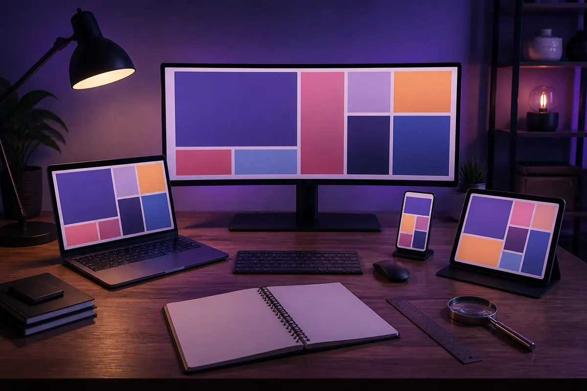
Responsive web design means one website adapts its layout to the screen it is shown on, so the same page works on a phone, a tablet and a desktop computer. It needs a correct viewport setting, layouts and images that scale, and style rules that change at certain widths. You can check it by resizing your browser and opening the site on a real phone.
What "responsive" means
Screens differ in size, and so do the ways people use them: fingers on a phone, a mouse on a computer, sometimes both on a touch laptop. Instead of building a separate mobile site, a responsive site uses one set of pages that rearranges itself. A row of three columns on a desktop may become a single column on a phone.
The three ingredients
The viewport setting
A line in the page header tells mobile browsers to use the real width of the device. Without it, many phones show a zoomed-out desktop version with tiny text. Avoid settings that block users from zooming, because they hurt accessibility.
Flexible content
Images should be allowed to shrink to the width of their container, and layouts should use relative sizes such as percentages and modern layout tools instead of fixed pixel widths. A well-built page never forces visitors to scroll sideways. Setting width and height on images also reserves the space, which reduces layout jumps, as covered in the Core Web Vitals guide.
Rules that change at certain widths
Style rules called media queries apply different layouts depending on the screen. They can respond to width, height, orientation and some device capabilities. Test capabilities such as hover carefully, because touchscreen laptops blur the line between a phone and a computer.
Choosing where layouts change
The points where a layout changes are called breakpoints. The practical advice is to base them on your content, not on specific devices. Start with the small-screen layout, then widen the browser until the layout starts to look wrong, and add a change there. Add smaller adjustments for spacing or text size where needed. Keep text lines at a comfortable length, and do not hide important content just because a screen is small.
Text, images and tap targets
- Text: large enough to read without zooming. More on this in the typography guide.
- Images: sized for the screen and compressed, so phones do not download huge files.
- Buttons and links: big enough to tap and spaced apart. Menus are covered in the navigation guide.
- Forms: short, with large fields, so they are easy to complete on a phone.
How to test your site
- Open the page on a computer and drag the window narrower. Watch for text running off the screen and elements overlapping.
- Open the browser's developer tools and switch on the device view. It shows how the page looks at common phone and tablet sizes and lets you see where breakpoints apply.
- Open the live site on at least one real phone. Rotate it to landscape and try the menu, a form and a link.
- Test with larger text settings, which many people use.
Common problems
- Sideways scrolling caused by a wide image, table or fixed-width block.
- Text so small that visitors zoom in.
- Menus that cannot be tapped or open under the thumb.
- Pop-ups that cover the whole screen and cannot be closed.
- Important content removed on small screens.
Think small screen first
Designing the phone layout first is a useful discipline, because the small screen forces you to decide what matters most. Put the main message and the main action near the top, keep the first screen simple, and add secondary content as space allows. A layout that works on a narrow screen can usually be widened without much trouble, while squeezing a crowded desktop page into a phone is much harder.
Tables, videos and embedded content
Wide tables, embedded videos and maps are the usual sources of sideways scrolling. Let embedded content scale with its container, and give wide tables their own scrolling area or restructure them into stacked rows on small screens. Check every embedded widget on a phone, because third-party code does not always adapt on its own.
Respect user settings
Many people increase the text size in their phone or browser, or zoom in on pages. A responsive site should still work in those cases, so avoid locking text sizes or blocking zoom. Test one page with larger text and see whether buttons and menus still fit.
A short checklist before launch
- The viewport setting is present and zooming is not blocked.
- No page needs sideways scrolling on a phone.
- Text is readable without zooming and lines are not too long.
- Buttons are large enough to tap and are not too close together.
- Forms work with a phone keyboard.
- Images are compressed and sized for the screen.
- Important content is the same on phones and computers.
FAQ
Is responsive design the same as a mobile app?
No. A responsive site runs in the browser and has one address. An app is installed and built separately for each system.
Do I need a separate mobile site?
Usually not. One responsive site is easier to maintain and avoids duplicate pages.
How do I fix sideways scrolling?
Find the element that is wider than the screen, often an image, a table or a block with a fixed width, and let it scale or scroll within its own box.
Does responsive design help SEO?
It helps visitors, and sites that work well on phones give search engines fewer problems to deal with. See how Google Search works for the bigger picture.
How many breakpoints do I need?
As many as your content needs. Many small sites work well with two or three.
Your next step: open your homepage on your phone, rotate it, and note anything that is hard to read or tap. Fix the biggest problem first.